Placing spreadsheet data into a table quickly formats it and makes it easy to work with and analyze. Here’s how to use this basic yet powerful Excel tool.

Credit: Shimon Brathwaite / IDG
Tables are one of the fundamental tools in Excel. Putting your data in a table makes it visually appealing and much easier to read.
Tables also make it easier to work with your data, offering built-in sorting and filtering tools as well as easy-to-use calculation features to help you get useful insights from your data. In fact, some advanced Excel features, such as its new genAI-powered data analysis, require you to put your data in table format first.
In this story, we’ll get you up and running with tables in Excel, from creating and formatting them to performing calculations on their data. Below is the sample data we will be using, if you’d like to copy and paste it into a blank Excel worksheet and follow along with the tutorial:
| Item | Jan | Feb | March |
| Lemons | $300 | $220 | $240 |
| Bananas | $190 | $190 | $170 |
| Apples | $220 | $170 | $120 |
| Pears | $170 | $200 | $190 |
We’ll demonstrate in Excel for Windows with a Microsoft 365 subscription. If you use a different version of Excel, most steps will work similarly, but you may not have all the features shown here.
How to make and format a table in Excel
To create a table in Excel, go to the Insert tab on Excel’s Ribbon toolbar and select Table. The Create Table pane will pop up asking you to select the data you want to include in the table. Highlight the data you want in the table. If your data includes column headers (as our example does), click the My table has headers checkbox, and then select OK.

Shimon Brathwaite / IDG
Alternatively, you can start by selecting the data you want to include in the table and then selecting Insert > Table. The Create Table pane will pop up with the data range prepopulated.
After you click OK, the table will appear in place of the plain data you selected. By default, the table will typically be formatted with a dark blue header and alternating light blue and white rows, but you can choose between several different colors and designs. To do so, click on the table you created, select the Table tab in the Ribbon, and scroll through the table design options at upper right. Click on any design, and your table’s formatting will instantly change to match. For this demonstration, we’ll select the yellow coloring.

Shimon Brathwaite / IDG
And that’s it. It took all of 20 seconds to create and format a table in Excel.
How to use a Total row for quick calculations
Next, you’ll add calculations to your table. This lets you summarize information easily for viewing. To do so, click on your table, navigate to the Table tab in the Ribbon, and check the Total Row option. A row marked “Total” appears at the bottom of the table. By default it shows the sum of the numbers in the final column of your table.

Shimon Brathwaite / IDG
What if you want to show totals for the other columns in the table — or show something other than sums in the final row? Based on the name, it would seem that you can only use the Total row for totals, but that is not true. If you click in any cell in the final row, a downward pointing triangle icon appears next to it. Click the triangle and a dropdown appears. You can calculate many different values, such as average, minimum, maximum, standard deviation, and more, and you can calculate each column.

Shimon Brathwaite / IDG
If you choose to show calculations for multiple columns in a table, you’ll want to use the same calculation for each one so they’re consistent across the Total row. You’ll also want to label the row appropriately. If you’re showing averages in the Total row, for instance, change “Total” to “Average” in the first cell.
How to sort and filter data in an Excel table
In addition to making calculations, tables allow you to easily filter or sort data so that it can be presented in the way that you like.
Sorting
To sort items by ascending or descending order, simply click the downward triangle next to any column header and select Ascending or Descending on the pane that appears. If you’ve chosen a column with text, the rows will be arranged from A to Z or from Z to A. If you sort on a column with numbers, they’ll be arranged from lowest to highest or from highest to lowest.

Shimon Brathwaite / IDG
Sorting on a column brings the whole row along. In our sample data, for instance, sorting on column A in ascending order moves Apples to the top row — and the Jan, Feb, and March sales figures for Apples also move to the top row. This keeps all the relevant data together.
Filtering
You can also filter out some items completely to limit what is shown. This doesn’t delete any of the table data; it simply hides it so you can zero in on a subset of your data.
To do so, click the button next to the column header and then find the list of items in the column near the bottom of the pane that appears. Uncheck items until only the desired ones are left (in our case, Apples and Bananas).

Shimon Brathwaite / IDG
The final product looks like this:

Shimon Brathwaite / IDG
To go back to the normal view where all of the data is visible, simply click the column header button again and select Clear Filter.

Shimon Brathwaite / IDG
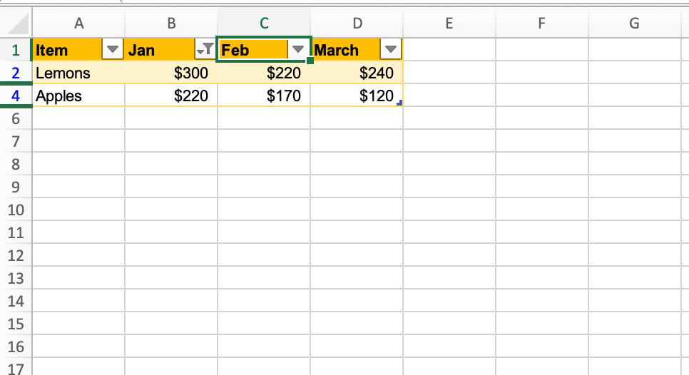
Tip: When you’ve sorted by a column, the button next to that column header changes to show an arrow pointing up next to the downward triangle. When you’ve filtered the items in a column, the button shows a funnel next to the triangle. And when you’ve both sorted and filtered the data, the button shows both an up arrow and a funnel. This indicator lets you know at a glance when sorting or filtering has been done to a table and which column it’s been done on.
Another way to filter is based on certain criteria, such as showing only items with numbers greater than a certain value. This is called conditional filtering. To see this in action, select the down arrow triangle to the Jan header. In the center of the pane that appears, click the first Equals dropdown and change it to Greater Than or Equal To, then type in 200 in the field to the right. Click the radio button for And. Then change the second dropdown to Less Than or Equal To and type in 300 on the right.

Shimon Brathwaite
This sets the filter to show only items that have values from 200 to 300 in the Jan column, as shown below.

Shimon Brathwaite
How to create a calculated column in an Excel table
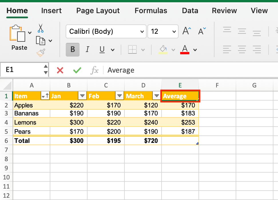
The Total row we discussed earlier calculates table data in a column, but you can also calculate data across rows. To do this easily, simply click the cell to the right of the final column in the first row of your table that contains data. Then, type in =average and select AVERAGE from the dropdown that appears. Highlight the entire row, and Excel fills in the rest of the formula to calculate the average for the values in the row. Hit Enter.

Shimon Brathwaite
Once you hit Enter, not only will Excel calculate the average for that row, but for all of the rows in the table — and it will use formatting that is consistent with the rest of the table. Thus, you’ve created a whole column simply by entering one function. Microsoft calls these calculated columns.

Shimon Brathwaite
Note: Excel will typically give the new column a name in line with the other headers (in this case “April”), so you might want to rename it to something more fitting, like “Average.”

Shimon Brathwaite
Average isn’t the only calculation available in table rows. You can also perform sum, minimum, maximum, item count, and a host of other operations. See “How to use Excel formulas and functions” for an introduction to the functions available in Excel.
How to create a chart from a table
In this final section, you will learn how to make charts based on data stored in tables — a great way to visually present that data. To begin, highlight all the data rows in your table (not the header row or the Total row). Navigate to the Insert tab, select Recommended Charts, and choose the second chart — the Clustered Column chart with no line running through it.

Shimon Brathwaite
A clustered column chart will appear on your worksheet, but you’ll notice that the labels at the bottom don’t reflect your header names. Let’s change that. Right-click the chart and choose Select Data from the menu that pops up.
On the Select Data Source screen that appears, select each legend name on the left and change it to the appropriate month by typing the month name in the Name field to the right. Once you have changed all four, click OK to apply the changes to the chart.

Shimon Brathwaite
The chart now shows the correct legend labels. As a final improvement, double-click the title of the chart and rename it to “Sales Table.”

Shimon Brathwaite
Of course, you’re not limited to column charts; there are dozens of chart styles to choose from in Excel. On the Ribbon’s Insert tab to the right of Recommended Charts, you’ll find dropdowns for various styles of column charts, line charts, and pie charts, as well as an array of specialized charts such as treemap, histogram, scatter charts and more. It’s worth experimenting with different styles to see which works best to present the data or trend you want to highlight.
More Excel tutorials:
- How to use PivotTables and PivotCharts in Excel
- How (and why) to use conditional formatting in Excel
- How to use Excel formulas and functions
- How to use Excel macros to save time and automate your work
- 8 simple ways to clean data with Excel
- Handy Excel keyboard shortcuts for Windows and Mac
Related content
- news analysisOpenAI brings its ChatGPT app to all Mac users You no longer need to pay to use the ChatGPT app on an Apple Silicon Mac.By Jonny EvansJun 26, 20244 minsMacChatbotsApple
- newsChatGPT users speechless over delays OpenAI has delayed an alpha release of its new voice mode for ChatGPT, citing safety and scalability concernsBy gyana_swainJun 26, 20244 minsGenerative AIVoice AssistantsArtificial Intelligence
- opinionCongress warns Microsoft about foreign hackers again — will it matter this time? After a Chinese-government sponsored espionage group hacked into US government email accounts last year, it seemed as if Microsoft might be in hot water. But so far, little has changed.By Preston GrallaJun 26, 20247 minsGovernment ITGovernmentCyberattacks
- opinionAI regulation: While Congress fiddles, California gets it done California, which has the world's fifth-largest economy, is taking the lead in much-needed protections for tech privacy and AI regulation.By Scot FinnieJun 26, 20245 minsRegulationGovernmentGenerative AI
SUBSCRIBE TO OUR NEWSLETTER
From our editors straight to your inbox
Get started by entering your email address below.